Tuesday, 24 May 2011

A Colouring Masterclass

I spent a very enjoyable Saturday at Ashford, Kent this last weekend attending LOTV Colouring Masterclass with Jacqui Dennis and Bev Rochester. To have the opportunity to attend a class with these two wonderful colourers was one that I just couldn't take the opportunity to miss and I was not disappointed. We were given the choice of using either Copic pens or Promarkers and I went with the Copic pens and was very pleased with the result that I achieved with them.


I had not done much colouring with them before, especially after I knew that I was going to attend this class.

We were going to learn to colour an animal first and was given the stamped image of James Bear to colour first. This was to learn how to colour fur.

I liked the idea that we were given the stamped images rather than having to stamp them ourselves, although if anyone had not stamped, then Jacqui was available to show you how to get the perfect image. This meant more time could be spent on colouring.


Once we had finished the image with the pens, we were then shown how to use Prisma pencils or polychromos with a blending stump to finish the colouring and make it stand out more. This was a technique that I had not used before and was surprised at the difference that it made to the image.

Once that image was finished, we we then given the stamp "Sailing Boat" to colour. This was chosen so that we would be able to learn how to colour flesh and also to colour hair. It was also an opportunity to learn how to colour white images which we used on the sail. You don't actually leave it white but put some shading in which then made sense once we did this. We did not finish this image with the pencils as this could be done at a later time as there were two other projects to complete. It was to mainly learn the techniques rather than spending time finishing each image. It was good that enough was completed without spending too much time on each one.

After this, we were given the "Love Grows" stamp to colour and this one was the most difficult due to the fact that there were lots of small bits to colour and quite a few different elements. Although there were a lot of elements to colour, we used relatively few colours as too many colours can ruin the design. We also coloured all over the dress and pot as the colour around the spots would be too time consuming on the day but would be done that way if you were colouring at home.


We were also taught about going around the image with either a copic pen or with a pencil to emphasise the image. I used a light blue polychromo pencil around the top and sides and then worked it in with a blending stump. We could then finish the image and make a card out of it as all card, paper and embellishments were provided to enable us to do this.


Most of the class chose to take the pack home and to colour in another image at the class. This time, the image that was provided was "Rosie" and seems to look rather blotchy faced in this photo but does not on the card and I really should not have rushed the shoes last night without my glasses on as this was the only colouring I did not do on the day.


I really thought that Jacqui and Bev did a fantastic job and I got an awful lot out of this day. I liked the idea that we all received a small booklet of the techniques that we had learnt on the day and the hotel that Jacqui picked was ideal.


Laila, Lisa and the staff of Lily of the Valley did a great job organising the day and I even managed to top it off by having my name pulled out of the raffle for a bottle of Cava. Of course, I spent too much money at the shop but then what point is there of going to a class without picking up some supplies that you always need!

Sunday, 17 April 2011

Workshop with Sheena


While everyone was trying to get to London for the Marathon and the football, I was trying to get to Milton Keynes for a workshop with Sheena Douglass. I decided to catch the train as I knew that there were problems with the M1 but did not realise that the trains would be out as well! I knew that things were not going to be easy when at first the ticket office area of Virgin trains was closed as everyone was queueing up to get their tickets from just one ticket office and one machine. I found a quieter machines and got my ticket only to be confronted with no trains due to overhead line problems in the Wembley area - still, the ticket area was now open! Twenty minutes after scheduled departure time I was still on the platform waiting.


The train eventually pulled out just over 25 minutes late - giving everyone a run down to the platform to ensure they got onto the train before it departed. Luckily, on arriving at Milton Keynes station there were plenty of taxis waiting and managed to get one that got me to the workshop just on time. It certainly was not a good way to start and I did not want to miss any of Sheena's workshop.


The workshop was for Sheena's "Paint Fusion" and we were informed that we would complete three projects, which we did. One thing about a workshop with Sheena is that you know that you will get plenty of humour as well throughout the day and she certainly did not let us down.


The first project was the Lavender bookmark. This was using one of the "Simply Sweet" stamps in her "Paint Fusion" series. Instead of painting a white card with a dark colour, we used a dark mountboard and then added the pva glue and paint to create the crackle effect. The image was then stamped on and using the acrylic paints added the green for the stems, the rope around the bunch, the two colours for the lavender and the shading underneath. The bookmark was then aged with distress ink and edged with one of Sheena's WOW embossing powders. To finish, it was sprayed with gold Spray and Sparkle. Although you cannot see it in this photo, the Spray and Sparkle really finishes the bookmark.


The next project was to make a card and for this we used the same stamp set but the bouquet stamp. This was stamped onto watercolour card with perfect medium and embossed with Sheena's WOW embossing powder in gold onto card cut with a spellbinder die. Colour was then added to the middle of the bouquet with a brush to create a stippling effect. The leaves were then coloured using green and white and then using a cotton bud, colour was put on to create the flowers. The centre of the flowers were also using a cotton bud. The dots were made by using the end of a piantbrush and each time you stamp, the dots get smaller. This piece was then mounted onto a faux spellbinder shape and then mounted on white card to finish.


The last project was a painting on a frame that can be bought from a well know swedish store that will not break the bank. The frame was first lightly sanded and then stamped with black Stazon using the "Berries" set. The leaves were made using a light and dark green double loaded onto the brush and using small zig zag strokes. The leaves were then joined using thin brown strokes. The berries were made using my thumb to create the berry shape in pink and then using the eraser on the end of a pencil to put the blue colour on top, creating the texture. Light was then added by adding white paint and some slight shading under each berry by mixing blue and brown together.


All the these project look far better in reality than I can photo as the texture does not really come out but it does show that you do not need to paint to be able to get good results with these stamps. Sheena really does make her workshops fun - but does also make sure that you go away having learnt new techniques.

Sunday, 3 April 2011

Another card for Challenge 11

I liked the aqua and brown together so much that I decided that I would make another card - and using the same papers as the previous card just in a different colourway for the background. I prefer this card to my previous one although the aqua colour does not show up very well in this photo and was not able to get it to show better.

I have again used the Argyle Foundation Paper but used the brown rather than the aqua. This is a double sided paper but prefer this side to the other. This time, instead of just using the Scroll Lace corner punch, I also used the Around the Page punch to create both of the layers, using the Core'dinations brown and the Foundations aqua. These punches are really easy to use and create a lovely effect for your cards. I will now be looking for a couple more next time I go out craft shopping - although again, I had all that I needed in my stash to complete this card.


I stamped the image from the Fairyopolis stamps onto aqua card and again coloured in using distress ink. I then added a small bow using aqua and brown ribbon and finished off with roses from Wild Orchid Crafts, who have some really lovely flowers on their website.

Saturday, 2 April 2011

Crafter's Companion Challenge 11

This month's challenge was to use the colours aqua and brown and I just love the way that these colours go together. I was pleased that I actually got to use some of my stash and did not have to purchase anything else to complete the card. Now if I could only do that every time! I also thought it was time to use the new Flower Fairies Fairyopolis stamps and these turned out to be just the right size for what I wanted to do. The background paper was Argyle Foundation paper and I used a Martha Stewart Corner Punch Scroll Lace and the brown was Core'dinations and cut using one of the new Spellbinders - the Fleur de lis rectangles. The image was stamped onto Aqua Foundation card also stamped using the same Spellbinder set and then coloured using distress inks. I added colour to the outside of the Aqua card again with distress ink - using the Tumbled Glass. The flowers were some that I had in my stash and I think that I had bought them from Hobbycraft some time ago. I use the Core'dinations brown and Foundations Aqua to create the tag which I have left blank until I need to put a sentiment on as I have not decided whom will get the card and for what purpose.

Friday, 25 February 2011

What a way to spend a Thursday

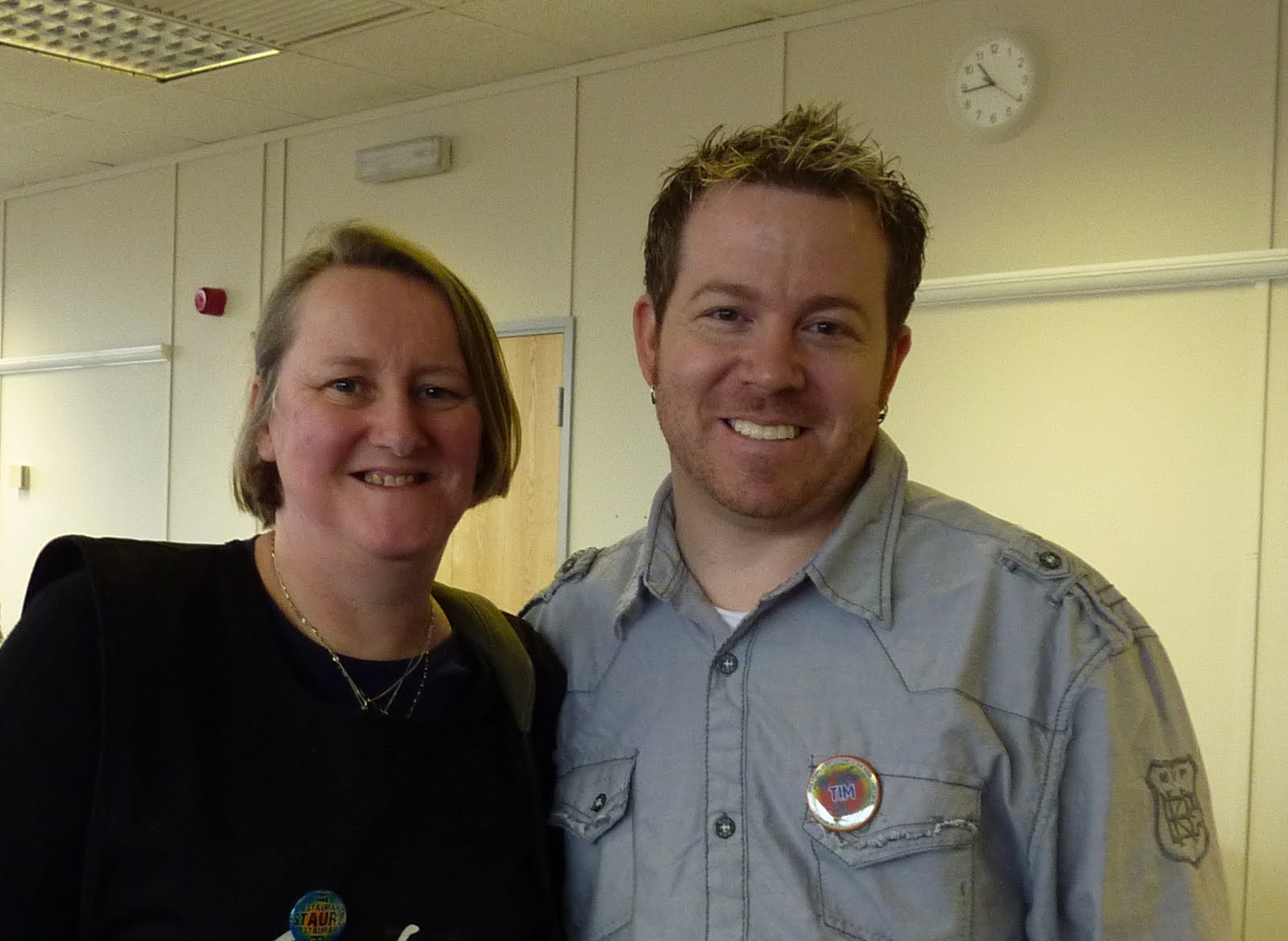
Wow, yesterday was a great crafting day. I spent the day at an Artsycrafts event and had the privilege of a 4 hour workshop with the amazing Tim Holtz and then a 3 hour workshop with Lin Brown and Leandra Franich. The workshop with Tim was using his 'Configurations' boxes and we got to play with a lot of stuff. We used a great product which was Claudine Hellmuth Multi-medium Mattte and I was surprised how much of that I could get through. It glues anything and dries clear but with a matte finish rather than a glossy finish. It seems to stick everything to everything and once it has dried completely - it ain't moving anywhere. Tim was superb and really friendly and funny. He has a great way to get you to think differently and I must admit that I did not think that I would like what I made, I loved what I did and even bought some more blank configuration boxes to make more - although I have decided that I will call them my 'memory boxes'. The embellishments that were provided were superb and Tim had a way of not making you feel rushed. I left a couple of spaces to put in some nick-nacks I had at home which I would like to go into it. It really was something different for me and took me right out of my comfort zone but I went into it thinking that I would learn new techniques and was always good to be made to think outside of the box. It ended up being something that I really enjoyed and had the added bonus of ending up with something that I really liked.

After I had finished Tim's workshop, I did a workshop with Leandra and Lin and this was a Colourwash Tree House. It was made using a variety of techniques that I had not really used before but was messy! I tried to use gloves but in the end gave up and just put up with messy hands. Although it was only meant to be a 2 1/2 hours workshop, most of us needed 3 hours to complete but as this was at the end of the day, who is going to complain of extra crafting time given. Some of the cutting has been done before hand to ensure that we would all be able to complete our items but this did not take away any of the techniques - only the parts that we could all do. We used paper, metal, chipboard, Ranger colourwash spray, PaperArtsy Fresco Finish paint, some of the Ideology goodies from Tim Holtz and of course Tissue tape from Tim.


I really enjoyed my day and felt that it pushed me in directions that I would not usually take but that was good. The amount of work and preparation that must have gone into this workshop was very much appreciated and think that a tremendous job was done to make an extremely enjoyable day for all.

I even got to go home with 2 finished samples which was an added bonus as did not expect to at the beginning of the day.

Tuesday, 22 February 2011

Mother-in-Law's Birthday Card

I obviously found my packs of Dufex in the cupboard as I have made yet another card using it! This card was for my Mother-in-Law's birthday and she just loves cats. On seeing these designs by Dufex I knew that I just had to use one of them on her birthday card. The hardest thing was choosing which one of the three cats to use so left that choice to my husband.

Although it does not show up on the main photo, the design has been decoupaged and then matted onto shades of blue card that I bought in a pack from The Range. I also used the same card to matt and layer the greeting. I wanted to keep the background plain so as not to detract from the cat image and the main card was a blue pearlescent card from the Centura Bright card pack from Crafter's Companion. The side of the card was punch with a Martha Stewart punch and then a layer of the blue card laid behind as a border.

It was obviously the right choice of card as I received a phone call from my Mother-in-Law who was very pleased with it.

Crafter's Companion Challenge 9


I thought that I would use this card as my 'Romance' challenge card. It has been made for my Brother-in-law but trying to get near to the Claret and Blue of his beloved football team. I used a hue lighter as I did not want the card to be too dark.

I have used Dufex for the images on a background of a paper from Core'dinations Gemstones. I used some heart ribbon that I bought up in Fleetwood for the side borders and cut out a wrapture in more paper from Core'dinations Gemstones and then used more ribbon that I bought in Fleetwood.

Although it does not show in this photo - there is a lovely pearlescent sheen to the card. inside the card, I have put a border or Dufex down the right hand side and finished it with an insert that has the image of the main topper faded behind the words.