Monday 12 December 2011

This years Christmas Cards

I was really pleased this year as I managed to get all my cards made by the end of October and had them all addressed and stamped by the first weekend of November.  I was determined to be organised this Spellbinders bought out some great dies this year.

I took the idea for the cards from Sue Wislon but made a few changes such as the holly motif behind the ornaments.

I used Creative Expressions Embossing Folder Lattice to emboss the background and and used the Spellbinder Holly Motif topped by the 2011 Heirloom Ornament.

The crinkly edge ribbon was put the width of the card and the bow made out of the same ribbon was then added.  I tied the bow and to get them flat I put them in an old notebook then sat on them at work for a couple of hours to flatten them.

I added a sentiment to one of the Grommet tags and then attached onto the ribbon.  I used three different sentiments so that not all would get exactly the same.  I then finished the card off by adding pearls made from Cosmic Shimmer PVA Glue in Berry Red.

 
I was really pleased with the result and glad that I had got them out of the way early.  I was unsure of the postage so took them to the Post Office to get them to check on the postage and was told that they would be normal 2nd class postage.  I thought I would make sure that I got it right.  I sent them all off and most of them seemed to get through but to my consternation, a couple of them required extra postage.   

It seemed that the Royal Mail didn't like the bow on a couple of them so charge the recipient extra postage.  Seeing as they were all the same as I had made sure that they were flat, it was very annoying and embarassing that extra postage was charge on a couple.  Next time I put bows on, I will ensure that I put a large second class stamp on the envelope rather than the normal, despite what the Post office tell me.

Monday 21 November 2011

Black and Red

With the Spellbinders Pick of the Week on Create and Craft renewing my vigour, I decided to make a card that I had seen on Sue Wilson's blog.  I used different colours, ribbon and sentiment to her.  I decided that I would make it in black and red as I had found some black/red reversible ribbon when I was in Jersey CI in the summer. 

I wove the ribbon using a technique that I had learnt from Sue at one of her workshops.  The main panel was embossed using the Budding Vine embossing folder and the sides were created with the Spellbinder Parisian Accents die. I then put pearls down the side by using Cosmic Shimmer Black PVA Glue.

The black die cut was made by cutting two Parisian Accents motifs and joining them together. 

I used a Parisian Accents motif for the corner and the sentiment was stamped onto a Spellbinders Label 20. I edge the label with Black Soot Distress ink.  I added Creative Expressions organza roses at each end of the ribbon and used  roses  from http://www.wildorchidcrafts.com/ to finish this card.

Thursday 17 November 2011

A Card for Christmas

I thought I would post the first of my Christmas cards for the year.  The receipient of this one will have received this by now so I can put it on the blog.

This is not the one everyone will be getting, that one won't go up until a few days after I have sent them all out.  This one was made using the Spellbinders label 4, Praising stamp plate from The Adorables Christmas Collection, greeting stamp Xmas Medallions Set 2 from and background paper from The Adorables Christmas Collection CD.  The ribbon is blue crinkly edge ribbon from Creative Expression and the pearls on the ribbon was added using Cosmic Shimmer Pearl PVA Glue.

The stained glass window was coloured using different distress inks and the choir boy was coloured in using Copic Pens.  The layering colour was obtained by using the same ivory card but colouring the card with Distress inks so that each lay is a different colour.

The corners were finished off with a corner punch - both on the main card and background car - and also on the insert which again was printed from the Adorables Christmas Collection CD.

Monday 14 November 2011

A "Bit of a Do"

Yesterday I spent a lovely day in Rugby with the wonderful Jayne Nestorenko at her Christmas "Bit of a do".  This was a Christmas social rather than a workshop although as it was Jayne, we did have a craft project to do.  The morning started off later than usual and instead of settling down to crafting was to settle down to toasted tea cakes and coffee.

The project Jayne set was making Christmas crackers - but not just any crackers.  These crackers were sold at a well known high end store in Knightsbridge. They were made with cardboard, crepe paper and wrapping paper and certainly is not your normal run-of-the-mill cracker. I have not yet decided what embellishment to put on the top of cracker to finally finish this cracker off.

Although I have the black one here, we also were given papers to make a red one as well.  We could either finish on the day or take home to do so I have decided that I will make this later.

We also had a lovely 3 course meals and the afternoon was then spent finishing off the crackers and guessing the babies and wedding photos!

It was a really relaxed day and everyone seemed to enjoy the day and hopefully we will have another "bit of a do" next year.

Sunday 6 November 2011

Crafting with Jayne

I attended Jayne Nestorenko's last workshop of the year in mid October and yet once again, Jayne gave us some lovely project to complete.  As it was the last workshop of the year, it obviously had Christmas as its theme.  It was a great day as usual and had a really relaxed pace about it. The first project we made was this Christmas card.  The letter 'O' could either  used as a bauble or as a globe.  I decided to go for the bauble.  Gold leaf was used for the bow and the top of the bauble and the bauble was glittered on the reverse.  The tops of the letters were scattered with  Polar White Flowersoft and also underneath the letters.  This is quite a large card as it is an A4 card folded lengthways.  The letters and background papers were from Cute Companions Winter Tales CD and the stamp was from Cute Companions Christmas Magic stamp plate.

The next project was an exploding box with a Christmas Bauble inside.  This was a lovely box and I liked the fact that it can with a bauble.  The Bethlehem design that was on the box was also put onto the bauble.  Although I used silver on silver, it was still good but some put silver on black or white on black but any colour could be used.  The box was already cut out as we would not have time to do it all and Jayne had decided that there was no measuring going to be done on this day.  The Bethlehem stamp that was used was from the U Mount Stamp Sheet Xmas Medallion Set 2 as was the image on top of the box.  The images on the box sides were stamped with Versamark and then Black Sparkle Embossing powder was used.  The top of the box was sgtamped with Versamark and then embossed with True White Embossing Powder and then red glitter was added to the middle. 


The last project was a lovely gift envelope.  We first made a template of the gift envelope and once we were comfortable with that, we then folded a piece of blue card to make our gift envelope.  The image on the front is from a wooden stamp that I am not sure that you can buy anymore.  It was coloured in with cosmic shimmer/H20 watercolour paints although we only had a limited colour choice for once as it was at the end of the afternoon.  The snow effect at each end of the choir was achieved by cutting out the choir to a certain point and then tearing the paper to achieve that look.  The gift tags inside the envelope were cut with Spellbinders Holiday Tags dies.  The snow was added to envelope by using an Inkessentials white pen and just doting randomly over the dark blue card.  If you are giving someone money  or gift vouchers then this is an ideal wallet to put give them in.

Monday 31 October 2011

A Man's Birthday Card

I always find it difficult to make cards for my husband as I need to do it whilst he is not around and always seem to leave it late so that it is then a panic. Every year I promise myself that it will not happen this year but of course it does. For this year’s card I decided to use Creative Expressions stamp "Dream Cars".
 
I coloured the car in using Twinkling H20s and painted my husband's name as the number plate.

This was mounted onto some really lovely effect card that I bought from Jayne Nestorenko and I used the Fleur De Lis Rectangles from Spellbinders and mounted that onto some Core'dinations card that I had run through my Grand Caliber with That Special Touch Mica Masks - Metal Effect Mask and then sanded.

 I used some brads for the corner but as I did not want it to go right through the card, I cut the prongs off the back and glued them to the front of the card. The brads I used were Creative Expressions Antique Copper Screw Top Brad.

For the greeting, I again used a Spellbinder (one of the labels) on the same card as I mounted the car on and this time used Tim Holtz Washer and Tiny Fastener and again only glued it on to the card rather than pushing it right through.  I must admit to using a peel-off for the greeting but will say in my defence that I needed to be able to do something quick and that it does actually go with the card.

Next year I will plan his card earlier!!


Saturday 29 October 2011

Trifold Shutter Card

I was asked by a friend to make a birthday card for his son's 21st birthday.  He wanted a certain verse on the card and also photos of family and of his football team.  I was given a large envelope with lots of photos and at first was unsure how to tackle it.  I then decided that I would make a Tri Fold Shutter card with A3 card so that I could get as many of the photos on as possible without it being too overcrowded.  As I was not altering the size of the photos, I first made a template that would fit all the photos.

I also decided that I would used both sides of the card and have one side for family and the verse, and the other side for his football team.  I made the verse as the main focal point of the front of the card and matted and layered up card in the colours of the team.  It was then just a question of laying out the photos making sure that there was a good selection of the photos that I was given to use.

The reverse side of the card was matted and layered using football paper in the teams colours and again in coloured card in the same colours.  I made the details of the manager at the time as the focal point of the reverse.  There was a  copy of the team that played nearest to the day he was born and also a team photo of the team that season.  There was also the league table of where his team was in the league when he was born - not a lot different to now as they were in the second division then as well.  There was photos of his favourite players in the last 21 years and a few badges, programmes and the gates of the ground and even Bart Simpson in a West Ham kit.

With making this type of card, once his son has finished displaying it on the mantelpiece, he can put it in a frame as a permanent reminder.  Also this is not my usual type of card, I think hat it worked really well with the items that were given to me.  My main concern was the my friend and his son liked and and it was great to find out that they were both absolutely delighted with it. 

Thursday 27 October 2011

Finished card from Colouring Masterclass

After attending the LOTV Master Colouring workshop in May, I thought I would get round to finishing off the card that we were given at the end.  Instead of using my original colouring, I decided that I would test myself that it would work again colouring on my own without the tutors there to advise.  Obviously Bev Rochester and Jacqui Dennis did a good job as I thought that I have managed to colour this in without any problems and must have retained what they taught me!  I used copic pens to colour.

The stamp is "Love Grow" by Lili of the Valley (http://www.liliofthevalley.co.uk)/ and the embellishments were provided in our pack on the day.  I believe that the background paper is from http://www.nitwitcollections.com/.

I was really pleased with the overall effect of the card and felt that this workshop was money well spent.

Tuesday 25 October 2011

VIP Workshop with Jayne

I spent a nice Sunday with Jayne Nestorenko back in September on her VIP workshop.  This workshop was for crafters who have previously attended one of her workshops and as usual  are always a little special.  This time we had three projects to make - albeit one was very quick at the end.  Another good thing about Jayne's workshop are the quality of the 3 course meals that we have there that are included in the workshops.

The first project was the most difficult - lots of measuring which was mainly done on the Hougie Board - but we all got there in the end.  It was a gatefold card with the scenes from the Adorables Summer Collection CD and stamps.  The gatefold card had the added advantage of also having pockets on the front for gift tags. 


The idea of the card was to build up a scene using different stamps and backgrounds.  The striped backing paper was also from the CD. 

I was pleased that a beach scene was chosen as I would be able to add some of the shells that I picked up of the beach in Jersey.

I also liked the idea of being able to get the girl on the front of the card actually look like she was picking up a starfish from a rock pool.

Inside I added a couple of crabs and shells, life buoy and the little boy holding as spade and a bucket at his feet. 

The stamped images were coloured with a mixture of Twinkling H20s and Cosmic Shimmer watercolour paints. 

Again, as is the norm with Jayne's workshops, all of the cards were different.  She also ensures that there are a couple of different colour schemes each time to ensure that no two are the same.  There are also a large variety of stamps to ensure that everyone can choose something different and different colouring mediums are used to ensure all are different.

The next card we made was also a gatefold card, but this time there was not nearly as much measuring as before.  We would be building up a scene from the Adorables Summer Collection CD as before but this time we would not be stamping and cutting out to decoupage but instead we would be using the printed elements from the CD.  These elements were printed out on sheets for us and most were very similiar this time.

The scene that was chosen was a back yard on washing day.  You could choose what you wanted to go on the outside of the card and also what you would be hanging on your washing line and it was to represent the back yard of an.  I particularly liked that fact that the scene was layered up on the front of the card with a door that opened to reveal an outside toilet, if you really didn't like the door opening and showing the toilet you could have just left it uncut so that the door did not open but I felt that it showed a back yard as it really was.

A down pipe and a post was cut out and then some metallic thread was attached to them stretching from one side of the card to the other.  Washing was then hung on the line,  ensuring that when the card was folded in, the washing folded in flat.  There was then a few items that could be cut out and attached to the front or inside the card.  I just left it with a pram outside.

The last items we made were a couple of boxes using the new Spellbinders Grand Shapeabilities Square Petal Top Box and the Spellbinders Grand Square Bracket Edge box, just to show how quick and useful they could be.

Sunday 23 October 2011

A Card for Mum

Another day and another blog. If I keep this up I should catch up with what I have been crafting over the last few  months.     

Today I thought that I would post the design of the cards that I made for my Mum and for her sister for their birthdays, although not the actual cards.

It was a design that I got from Sue Wilson using mainly Spellbinders and also the wonderful crinkly ribbon and organza roses that Sue has sourced. They can be purchased from Sam Poole's shop at http://www.creative-studios.co.uk/shop/

Although Sue used hat pins on her card, I decided not to use them as I prefer them without and did not want my Mum or Aunt to inadvertently prick themselves.

I don’t actually have a photo of the exact cards I made for them both, I thought that I did have but only on posting realised that I didn’t. I made theirs in black and white, with white being the dominant colour but I have included some that I made with different colours, including other variants of black and white.

There are so many colours schemes that you can do this card - it is just a question of finding the ribbons that match. The flowers need not be the organza type.  On the beige card I used flowers from http://www.wildorchidcrafts.com/

I definitely think that I went overboard on the red but all three look that little bit different. 

I have left the greeting banner blank of these so that I can add the required greeting when I use the card. For the cards that I have sent, I had typed the greeting in a font that I liked and with a matching colour onto some card and then with a Spellbinder die, ut it out and attached it to the front of the card.  I just then went over a little of it with a clear embossing pen and then clear embossing powder to make it stand out a little more. 

Saturday 22 October 2011

Back Blogging

I have been bad at blogging just recently.  I was starting to get on top of it and then spend a weeks holiday in Jersey and all went downhill from there.  At least I managed to get some lovely ribbon in a small shop in St Helier.  I just seemed to have so much to do since I came back but am determined to get back on top and will be posting what I have done since my last blog over the next few weeks.

I will start of with the workshop that I did with Jayne Nestorenko at the end of July.  This was a box with an easel card on the top and was really a lovely item to make.  The background image on the easel card was taken from the Adordables Summer Collection CD and the decoupage was part of the Adorables Summer Collection stamp sets. 

The box was made in two parts and a Martha Stewart Punch was used to decorate around the box lid.  The stopper on the easel card was using Marianne D Creatables Frames/Swirls (LR0116).  I used the Spectrum Noir pend to colour in  the young boy hiker.  Spellbinders were used to form the base, lid and card.

We also made four gift tags to go with the box.  I have found this box really usefull for storing small items as it is really strong.  It was really pleasing that Jayne has put a picture of this on her website.  It is always nice at a workshop with jayne that although everyone is making the same items, there are never two that look that same - individuality is certainly the name of the game with her.


Monday 11 July 2011

18th Birthday

Thought I would just put up a quick post of the birthday card that I made for my nephew's 18th Birthday at the beginning of this month. I really found it hard to do something that was not cricket or football as that is what he usually gets and wanted it reflect the fact that he is growing up. I don't usually use a stepper card but just thought that this would all go together and still be masculine.


For the card it was just a case of messing around with paper until I found the size that I wanted. I tyed with the idea of usng a template but then decided to do my own and it would then be exactly what I wanted rather than what I would be given. I used a digi image from http://www.mosdigitalpencil.com/ and as my nephew enjoys his food, thought an image of what not to become would suit him - did think about putting a can of beer around but as he is off to University in the US next month, it won't be legal for him there.


Spellbinder's die Lattice Rectangles was used around the image and then coloured using distress ink.The image was coloured using Copics and the background papers were from DCWV Natural Paper stack which has lots of good masculine colours. The greeting was a freebie from http://nettyscards.blogspot.com/ and just coloured on the computer.


The photo was taken on my mobile phone so not as good as it should be but wanted to ensure that I got it off in the post early rather than being late for his special occasion.

Sunday 10 July 2011

Going Native


Well, at least my stamps are rather than me. I spent a lovely Saturday in Kettering at one of Sue Wilson's workshops and the stamps used this time were the Native American stamps. The theme behind this workshop was textures, and Sue ensured that there were different textures to all of the cards - I must admit that they were superb. We were asked to pick a favourite out of all the cards that we made but I can honestly say that I was unable as I loved them all. I would make them all again.

This one above was made with a faux leather background which was done using tape, an embossing folder, distress ink and clear embossing powder and creates a real nice texture. We also cut using a Spellbinder die and the Out of the Box technique which looked easier than it was.


The one to the right was just stamped onto Hessian to give it a different look and the wooden beads at the side were coloured using distress ink and tied together using the leftovers from making the fringe and then attached with glue dots. The background was stamped using first black archival ink and then using a clear embossing ink and then dusted with gold mica. The edges of the black card and the black edge of the greeting were hole pierced. The main background was made using the Tim Holtz ruler and the greeting was pierced freehand.


The next one was made using a technique that I had never seen before but would definitely want to do again. The coloured background was made by spreading glue onto black glossy card and then dropping mica powder onto it. You did not want to glue too thick, neither did you want it to dry before heating from the underside with a heat gun until it bubbled. The bubbling gave the effect and it looks absolutely stunning in real life - much better than a photo can do justice too. There appear to be lines that are pretty even in the photo but they do not appear like that in reality. The lines are less defined and add to the overall effect. The pots were coloured using Cosmic Shimmer inks and mica powder. It was finished off just using pieces of coloured card inside the pot and glints and ribbon.


The next card was made using white glossy card for the cave painting background and sanding it both ways, putting on distress ink and then sanding again. Both the cave painting background and the brick coloured background behind were then torn before being layered. The string in the background was again more hessian string taken off the previous project .


The last card was the quickest and was stamped first with the nestie middle being laid down flat on the card and then embossed and stuck onto the card raised. The side was stamped with perfect medium and then dusted over with mica powder. The ribbon - which was absolutely beautiful was put under the gecko's tail by cutting the lower part of the tails so that the ribbon fitted under and this was done to show it can be done with lots of images for a different finish.

We were quite surprised that we actually managed to finish all five cards but were glad that we did and had such lovely cards to take home with us.


I suggested a pyjama party for the next workshop with Sue - can't wait to see if she takes me up on that but in any case, I just can't wait for her next workshop!

Wednesday 8 June 2011

Workshop with Barbara Gray

Workshops seem to be getting like London buses for me - you wait ages for one to come along and then end up getting a few together. This was a workshop that I was really looking forward to attending as I had always liked the look of brayering but never tried it.

The workshop itself was great but the getting there and back was a nightmare and made me realise that it was not a place to try and get to by public transport. Without the help of Barbara, it would have been even more of a nightmare. I certainly appreciated her sending Dave to my rescue when I found that I would have to wait an hour and a half for a taxi to get me there. Even more so of Wanda arranging for my handbag to be sent to me after I stupidly left it behind! I'm not sure Barbara would want me at another of her workshops!! It just wasn't my day but at least I remembered to take home my goodies that I bought there.


There were four projects to be completed on the day and were split into 4 groups and each group did a different one of the project from the rest. It was nice this way as the group were then kept small with everyone getting enough attention. Before we started on the main projects, we warmed up with using Clarity corner stamps to make patterns on copy paper to get used to the stamps.


The first project and third projects that I completed were classed as the easy project and the first was Zentangle (which I always thought was doodling!) and the second was using gilding flakes and made into a post card using Clarity stamps to stamp out the back of the card. With the first project, I found that I did not like using Promarkers - especially on glossy card and was not that keen on Zentangle. I quite enjoyed the gilding flake and this was made using Clarity Adhesive sheets which was a quick way of gilding.


The second and fourth projects were using the brayering technique I enjoyed these two a lot more. I used brayering to create the water and sky for the Love card and to create more of a background scene for the woodland card. These two card were much more pleasing to my eye and both used techniques that I would use again.


I like that fact that these workshops were more orientated around the techniques rather than the finishing of cards although all of the projects were completed and were ready to be mounted and used. I would certainly not hesitate to go back on one of Barbara's workshop and learnt some new techniques.

Tuesday 24 May 2011

A Colouring Masterclass

I spent a very enjoyable Saturday at Ashford, Kent this last weekend attending LOTV Colouring Masterclass with Jacqui Dennis and Bev Rochester. To have the opportunity to attend a class with these two wonderful colourers was one that I just couldn't take the opportunity to miss and I was not disappointed. We were given the choice of using either Copic pens or Promarkers and I went with the Copic pens and was very pleased with the result that I achieved with them.


I had not done much colouring with them before, especially after I knew that I was going to attend this class.

We were going to learn to colour an animal first and was given the stamped image of James Bear to colour first. This was to learn how to colour fur.

I liked the idea that we were given the stamped images rather than having to stamp them ourselves, although if anyone had not stamped, then Jacqui was available to show you how to get the perfect image. This meant more time could be spent on colouring.


Once we had finished the image with the pens, we were then shown how to use Prisma pencils or polychromos with a blending stump to finish the colouring and make it stand out more. This was a technique that I had not used before and was surprised at the difference that it made to the image.

Once that image was finished, we we then given the stamp "Sailing Boat" to colour. This was chosen so that we would be able to learn how to colour flesh and also to colour hair. It was also an opportunity to learn how to colour white images which we used on the sail. You don't actually leave it white but put some shading in which then made sense once we did this. We did not finish this image with the pencils as this could be done at a later time as there were two other projects to complete. It was to mainly learn the techniques rather than spending time finishing each image. It was good that enough was completed without spending too much time on each one.

After this, we were given the "Love Grows" stamp to colour and this one was the most difficult due to the fact that there were lots of small bits to colour and quite a few different elements. Although there were a lot of elements to colour, we used relatively few colours as too many colours can ruin the design. We also coloured all over the dress and pot as the colour around the spots would be too time consuming on the day but would be done that way if you were colouring at home.


We were also taught about going around the image with either a copic pen or with a pencil to emphasise the image. I used a light blue polychromo pencil around the top and sides and then worked it in with a blending stump. We could then finish the image and make a card out of it as all card, paper and embellishments were provided to enable us to do this.


Most of the class chose to take the pack home and to colour in another image at the class. This time, the image that was provided was "Rosie" and seems to look rather blotchy faced in this photo but does not on the card and I really should not have rushed the shoes last night without my glasses on as this was the only colouring I did not do on the day.


I really thought that Jacqui and Bev did a fantastic job and I got an awful lot out of this day. I liked the idea that we all received a small booklet of the techniques that we had learnt on the day and the hotel that Jacqui picked was ideal.


Laila, Lisa and the staff of Lily of the Valley did a great job organising the day and I even managed to top it off by having my name pulled out of the raffle for a bottle of Cava. Of course, I spent too much money at the shop but then what point is there of going to a class without picking up some supplies that you always need!

Sunday 17 April 2011

Workshop with Sheena


While everyone was trying to get to London for the Marathon and the football, I was trying to get to Milton Keynes for a workshop with Sheena Douglass. I decided to catch the train as I knew that there were problems with the M1 but did not realise that the trains would be out as well! I knew that things were not going to be easy when at first the ticket office area of Virgin trains was closed as everyone was queueing up to get their tickets from just one ticket office and one machine. I found a quieter machines and got my ticket only to be confronted with no trains due to overhead line problems in the Wembley area - still, the ticket area was now open! Twenty minutes after scheduled departure time I was still on the platform waiting.


The train eventually pulled out just over 25 minutes late - giving everyone a run down to the platform to ensure they got onto the train before it departed. Luckily, on arriving at Milton Keynes station there were plenty of taxis waiting and managed to get one that got me to the workshop just on time. It certainly was not a good way to start and I did not want to miss any of Sheena's workshop.


The workshop was for Sheena's "Paint Fusion" and we were informed that we would complete three projects, which we did. One thing about a workshop with Sheena is that you know that you will get plenty of humour as well throughout the day and she certainly did not let us down.


The first project was the Lavender bookmark. This was using one of the "Simply Sweet" stamps in her "Paint Fusion" series. Instead of painting a white card with a dark colour, we used a dark mountboard and then added the pva glue and paint to create the crackle effect. The image was then stamped on and using the acrylic paints added the green for the stems, the rope around the bunch, the two colours for the lavender and the shading underneath. The bookmark was then aged with distress ink and edged with one of Sheena's WOW embossing powders. To finish, it was sprayed with gold Spray and Sparkle. Although you cannot see it in this photo, the Spray and Sparkle really finishes the bookmark.


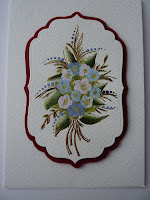
The next project was to make a card and for this we used the same stamp set but the bouquet stamp. This was stamped onto watercolour card with perfect medium and embossed with Sheena's WOW embossing powder in gold onto card cut with a spellbinder die. Colour was then added to the middle of the bouquet with a brush to create a stippling effect. The leaves were then coloured using green and white and then using a cotton bud, colour was put on to create the flowers. The centre of the flowers were also using a cotton bud. The dots were made by using the end of a piantbrush and each time you stamp, the dots get smaller. This piece was then mounted onto a faux spellbinder shape and then mounted on white card to finish.


The last project was a painting on a frame that can be bought from a well know swedish store that will not break the bank. The frame was first lightly sanded and then stamped with black Stazon using the "Berries" set. The leaves were made using a light and dark green double loaded onto the brush and using small zig zag strokes. The leaves were then joined using thin brown strokes. The berries were made using my thumb to create the berry shape in pink and then using the eraser on the end of a pencil to put the blue colour on top, creating the texture. Light was then added by adding white paint and some slight shading under each berry by mixing blue and brown together.


All the these project look far better in reality than I can photo as the texture does not really come out but it does show that you do not need to paint to be able to get good results with these stamps. Sheena really does make her workshops fun - but does also make sure that you go away having learnt new techniques.

Sunday 3 April 2011

Another card for Challenge 11

I liked the aqua and brown together so much that I decided that I would make another card - and using the same papers as the previous card just in a different colourway for the background. I prefer this card to my previous one although the aqua colour does not show up very well in this photo and was not able to get it to show better.

I have again used the Argyle Foundation Paper but used the brown rather than the aqua. This is a double sided paper but prefer this side to the other. This time, instead of just using the Scroll Lace corner punch, I also used the Around the Page punch to create both of the layers, using the Core'dinations brown and the Foundations aqua. These punches are really easy to use and create a lovely effect for your cards. I will now be looking for a couple more next time I go out craft shopping - although again, I had all that I needed in my stash to complete this card.


I stamped the image from the Fairyopolis stamps onto aqua card and again coloured in using distress ink. I then added a small bow using aqua and brown ribbon and finished off with roses from Wild Orchid Crafts, who have some really lovely flowers on their website.

Saturday 2 April 2011

Crafter's Companion Challenge 11

This month's challenge was to use the colours aqua and brown and I just love the way that these colours go together. I was pleased that I actually got to use some of my stash and did not have to purchase anything else to complete the card. Now if I could only do that every time! I also thought it was time to use the new Flower Fairies Fairyopolis stamps and these turned out to be just the right size for what I wanted to do. The background paper was Argyle Foundation paper and I used a Martha Stewart Corner Punch Scroll Lace and the brown was Core'dinations and cut using one of the new Spellbinders - the Fleur de lis rectangles. The image was stamped onto Aqua Foundation card also stamped using the same Spellbinder set and then coloured using distress inks. I added colour to the outside of the Aqua card again with distress ink - using the Tumbled Glass. The flowers were some that I had in my stash and I think that I had bought them from Hobbycraft some time ago. I use the Core'dinations brown and Foundations Aqua to create the tag which I have left blank until I need to put a sentiment on as I have not decided whom will get the card and for what purpose.

Friday 25 February 2011

What a way to spend a Thursday

Wow, yesterday was a great crafting day. I spent the day at an Artsycrafts event and had the privilege of a 4 hour workshop with the amazing Tim Holtz and then a 3 hour workshop with Lin Brown and Leandra Franich. The workshop with Tim was using his 'Configurations' boxes and we got to play with a lot of stuff. We used a great product which was Claudine Hellmuth Multi-medium Mattte and I was surprised how much of that I could get through. It glues anything and dries clear but with a matte finish rather than a glossy finish. It seems to stick everything to everything and once it has dried completely - it ain't moving anywhere. Tim was superb and really friendly and funny. He has a great way to get you to think differently and I must admit that I did not think that I would like what I made, I loved what I did and even bought some more blank configuration boxes to make more - although I have decided that I will call them my 'memory boxes'. The embellishments that were provided were superb and Tim had a way of not making you feel rushed. I left a couple of spaces to put in some nick-nacks I had at home which I would like to go into it. It really was something different for me and took me right out of my comfort zone but I went into it thinking that I would learn new techniques and was always good to be made to think outside of the box. It ended up being something that I really enjoyed and had the added bonus of ending up with something that I really liked.

After I had finished Tim's workshop, I did a workshop with Leandra and Lin and this was a Colourwash Tree House. It was made using a variety of techniques that I had not really used before but was messy! I tried to use gloves but in the end gave up and just put up with messy hands. Although it was only meant to be a 2 1/2 hours workshop, most of us needed 3 hours to complete but as this was at the end of the day, who is going to complain of extra crafting time given. Some of the cutting has been done before hand to ensure that we would all be able to complete our items but this did not take away any of the techniques - only the parts that we could all do. We used paper, metal, chipboard, Ranger colourwash spray, PaperArtsy Fresco Finish paint, some of the Ideology goodies from Tim Holtz and of course Tissue tape from Tim.


I really enjoyed my day and felt that it pushed me in directions that I would not usually take but that was good. The amount of work and preparation that must have gone into this workshop was very much appreciated and think that a tremendous job was done to make an extremely enjoyable day for all.

I even got to go home with 2 finished samples which was an added bonus as did not expect to at the beginning of the day.

Tuesday 22 February 2011

Mother-in-Law's Birthday Card

I obviously found my packs of Dufex in the cupboard as I have made yet another card using it! This card was for my Mother-in-Law's birthday and she just loves cats. On seeing these designs by Dufex I knew that I just had to use one of them on her birthday card. The hardest thing was choosing which one of the three cats to use so left that choice to my husband.

Although it does not show up on the main photo, the design has been decoupaged and then matted onto shades of blue card that I bought in a pack from The Range. I also used the same card to matt and layer the greeting. I wanted to keep the background plain so as not to detract from the cat image and the main card was a blue pearlescent card from the Centura Bright card pack from Crafter's Companion. The side of the card was punch with a Martha Stewart punch and then a layer of the blue card laid behind as a border.

It was obviously the right choice of card as I received a phone call from my Mother-in-Law who was very pleased with it.