Thursday, 16 February 2012

Babies Booties

I thought that it was about time I posted some of my work in parchment paper.  It is a craft that I really enjoy and the finished work can be stunning and you do not see it quite so much.  It is also great to make something different than card sometimes.

The booties that I have here are on parchment paper that has been coloured  with Pergamano Dorso colours.

I belieive the pattern was taken from a book but as I got the pattern some years ago, I am not too sure.  

It is quite quick to make - for parchment craft. There are only two pieces to the pattern and one of these - the sole of the bootie - has very little work on it.

I first colour the parchment paper with the colour I want and then with white ink draw the outline of the bootie and the sole of the bootie.  I then draw the flowers on in Tinta ink in a contrasting colour and emboss the flowers.  In white ink, I draw the stitch line around the bottom of the sole and the edge of the top and strap of the bootie.  I then pierce the parchment using a grid.  Once all that is done, I cut out the bootie and then glue the two pieces together, shaping the bootie.

It is a lovely gift to present to someone on the birth of their child. To personalise it, I make an inside to fit the bootie and then emboss the name, weight and date of birth on it and stick it inside the bootie.

Saturday, 11 February 2012

Colouring with Copics


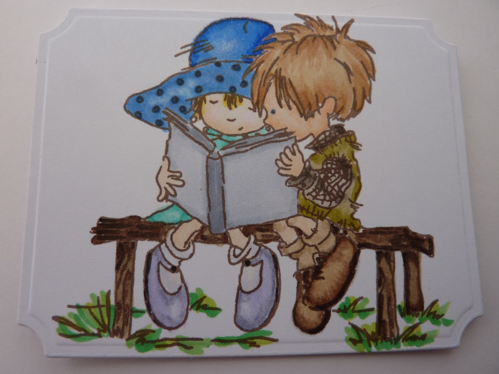
After taking the LOTV Masterclass in May, I decided that it would be time to put into practise what I had been taught.  I used a variety of stamps from Sheena Douglass, SWALK, Beatrix Potter, LOTV and Stampavie to give a good selection of both large and small areas to colour.  Most of them have flesh and hair as I think that if the most difficult to colour at times. 
  
I also coloured a couple with different colours just to give a different perspective to the images.  The first image is a SWALK stamp from Crafter's Companion and these was one of the images that I did in two colourways.  The second image is at the bottom as I found it too difficult to try and put the pictures side by side.


The second image is from Stampavie and I also coloured that in different colourways.  I liked this stamp due to the amount of flowers that is in the image which gives plenty of practice of colouring very small areas.  The other colour image of this is also at the bottom of the post.

The next image is from Sheena Douglass and has lots of large areas to colour.  I have coloured this in quite a few different colourways but only have the photo of this one and I prefer blues anyway.    This is an ideal one to colour if you only have limited colours as you do not need too use to many to get a nice coloured image. 


This image is from LOTV and I really like the cuteness of their stamps.  Also you can use more colours in this one and this was one that I really enjoyed colouring in.  I always used to think of colouring in as something all children did - until I tried it and realised that there is a lot more to it than just using the one colour and going for it!


The last image is from Crafter's Companion Beatrix Potter Collection and I used this as a practice image as it had needles rather than flesh to colour.  I need to try and get the right feel to this one with it being more spiny than normal faces.


I was pleased with these images but also know that I have still to improve but at least now I will stamp and colour as at one time I did not like to use rubber stamps at all apart from stamping greetings.  It is all a question of confidence and when you think about it - the worst that can happen is that you put it in the bin!!


Saturday, 28 January 2012

Scenic Stamps

As one of the people at work who had always like my cards and was keen to view what I had made was leaving, I decided that it was about time that I made her a card. 

I wanted to give her a card that was different to the one that she had previously seen and decided that it was about time to get out the stamps and ink that I had bought when I was at Ally Pally in September. 

I had stood at the Serendipidity stand and just loved the cards that were being made there with stamps by Stampscape.  Although the effect looked fantastic, the demonstrator did make it look easy but I wondered whether it really was.  I bought 7 stamps, 2 stamps pads and the glossy paper that was suggested and then got home and promptly put it my craft stash and left it until now.

The ink pad used for the background was KaleidaColor Ink Pad in Blue Breeze and this was put onto the glossy card with a brayer.  It does not show up too well on the photo but there is a blending of colours from dark to light on the card. 

I then stamped the scene using all 7 stamps that I had bought with a Versacraft ink pad in black  to create the scene above.  I stamped them onto a piece of plain paper first to ensure that the scene flowed.  I actually wished now that I had bought more stamps but was pleased with the effect that I achieved with what I had, especially as this was was first go at this technique.    It certainly won't be my last and I am looking forward to creating more scenes once I get some more stamps and will use my stash of Big 'n Juicy to create different backgrounds.


Wednesday, 18 January 2012

Card for January's Birthdays

I was going to make a card for my Mother-in-Law's and friends January birthdays using a design that I had used before but then realised that I had layered the cards without putting the ribbon on, so it was all change. I think I actually like these better than the ones I was going to make - maybe I have made too many of them before!  I used made them both in blue and white but used a lighter shade for my Mother-in-Law's card.  I used the darker blue and white for my friend's card as it is the same colours as our football team and I know that she will appreciate the thought behind it. 

I had already cut out the Elegant Posts for the top and bottom pieces of the card and decided that I would set it  landscape rather than portrait so that I could have a centre sentiment with the words that I wanted.  I used Spellbinders Lattice Rectangles, alternating the colour for each size.  With the final size, I printed out in matching colours, the sentiment that I wanted for each card and then cut it out with the Spellbinder die to ensure that the sentiment was centred correctly - and I do not know of a printer that would take card that small!

I then added roses that I had bought from willdorchidcrafts.com in opposite corners to finish the cards.  To ensure that they do not get damaged in the post, I have made box envelopes for them and also put an insert inside with a verse printed on some beautiful Gold Dust Shimmer paper that I got from ebay.  It is 120gsm and it a beautiful paper to use. 

Although this is my first post for the year, I am determined this year to ensure that I post at least twice a month - and even more if possible but at least I am setting a realistic target. 

Check back soon to see if I am actually achieving it!

Monday, 12 December 2011

This years Christmas Cards

I was really pleased this year as I managed to get all my cards made by the end of October and had them all addressed and stamped by the first weekend of November.  I was determined to be organised this Spellbinders bought out some great dies this year.

I took the idea for the cards from Sue Wislon but made a few changes such as the holly motif behind the ornaments.

I used Creative Expressions Embossing Folder Lattice to emboss the background and and used the Spellbinder Holly Motif topped by the 2011 Heirloom Ornament.

The crinkly edge ribbon was put the width of the card and the bow made out of the same ribbon was then added.  I tied the bow and to get them flat I put them in an old notebook then sat on them at work for a couple of hours to flatten them.

I added a sentiment to one of the Grommet tags and then attached onto the ribbon.  I used three different sentiments so that not all would get exactly the same.  I then finished the card off by adding pearls made from Cosmic Shimmer PVA Glue in Berry Red.

 
I was really pleased with the result and glad that I had got them out of the way early.  I was unsure of the postage so took them to the Post Office to get them to check on the postage and was told that they would be normal 2nd class postage.  I thought I would make sure that I got it right.  I sent them all off and most of them seemed to get through but to my consternation, a couple of them required extra postage.   

It seemed that the Royal Mail didn't like the bow on a couple of them so charge the recipient extra postage.  Seeing as they were all the same as I had made sure that they were flat, it was very annoying and embarassing that extra postage was charge on a couple.  Next time I put bows on, I will ensure that I put a large second class stamp on the envelope rather than the normal, despite what the Post office tell me.

Monday, 21 November 2011

Black and Red

With the Spellbinders Pick of the Week on Create and Craft renewing my vigour, I decided to make a card that I had seen on Sue Wilson's blog.  I used different colours, ribbon and sentiment to her.  I decided that I would make it in black and red as I had found some black/red reversible ribbon when I was in Jersey CI in the summer. 

I wove the ribbon using a technique that I had learnt from Sue at one of her workshops.  The main panel was embossed using the Budding Vine embossing folder and the sides were created with the Spellbinder Parisian Accents die. I then put pearls down the side by using Cosmic Shimmer Black PVA Glue.

The black die cut was made by cutting two Parisian Accents motifs and joining them together. 

I used a Parisian Accents motif for the corner and the sentiment was stamped onto a Spellbinders Label 20. I edge the label with Black Soot Distress ink.  I added Creative Expressions organza roses at each end of the ribbon and used  roses  from http://www.wildorchidcrafts.com/ to finish this card.

Thursday, 17 November 2011

A Card for Christmas

I thought I would post the first of my Christmas cards for the year.  The receipient of this one will have received this by now so I can put it on the blog.

This is not the one everyone will be getting, that one won't go up until a few days after I have sent them all out.  This one was made using the Spellbinders label 4, Praising stamp plate from The Adorables Christmas Collection, greeting stamp Xmas Medallions Set 2 from and background paper from The Adorables Christmas Collection CD.  The ribbon is blue crinkly edge ribbon from Creative Expression and the pearls on the ribbon was added using Cosmic Shimmer Pearl PVA Glue.

The stained glass window was coloured using different distress inks and the choir boy was coloured in using Copic Pens.  The layering colour was obtained by using the same ivory card but colouring the card with Distress inks so that each lay is a different colour.

The corners were finished off with a corner punch - both on the main card and background car - and also on the insert which again was printed from the Adorables Christmas Collection CD.